The Brief
Verdant was launching an organic food line across health stores in 3 cities and needed a brand identity built from scratch. The core challenge was standing out in a category completely saturated with hand-drawn illustrations, farmers market aesthetics, and overused earth tones - without abandoning the brand's genuine commitment to sustainability.

The Approach
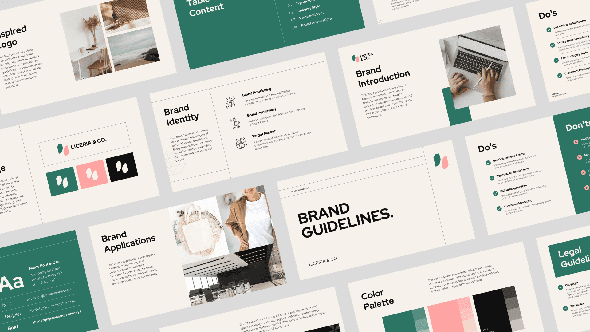
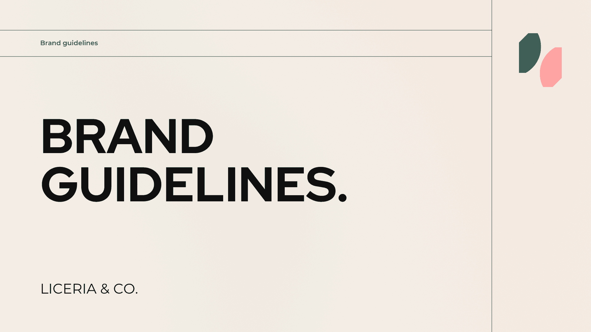
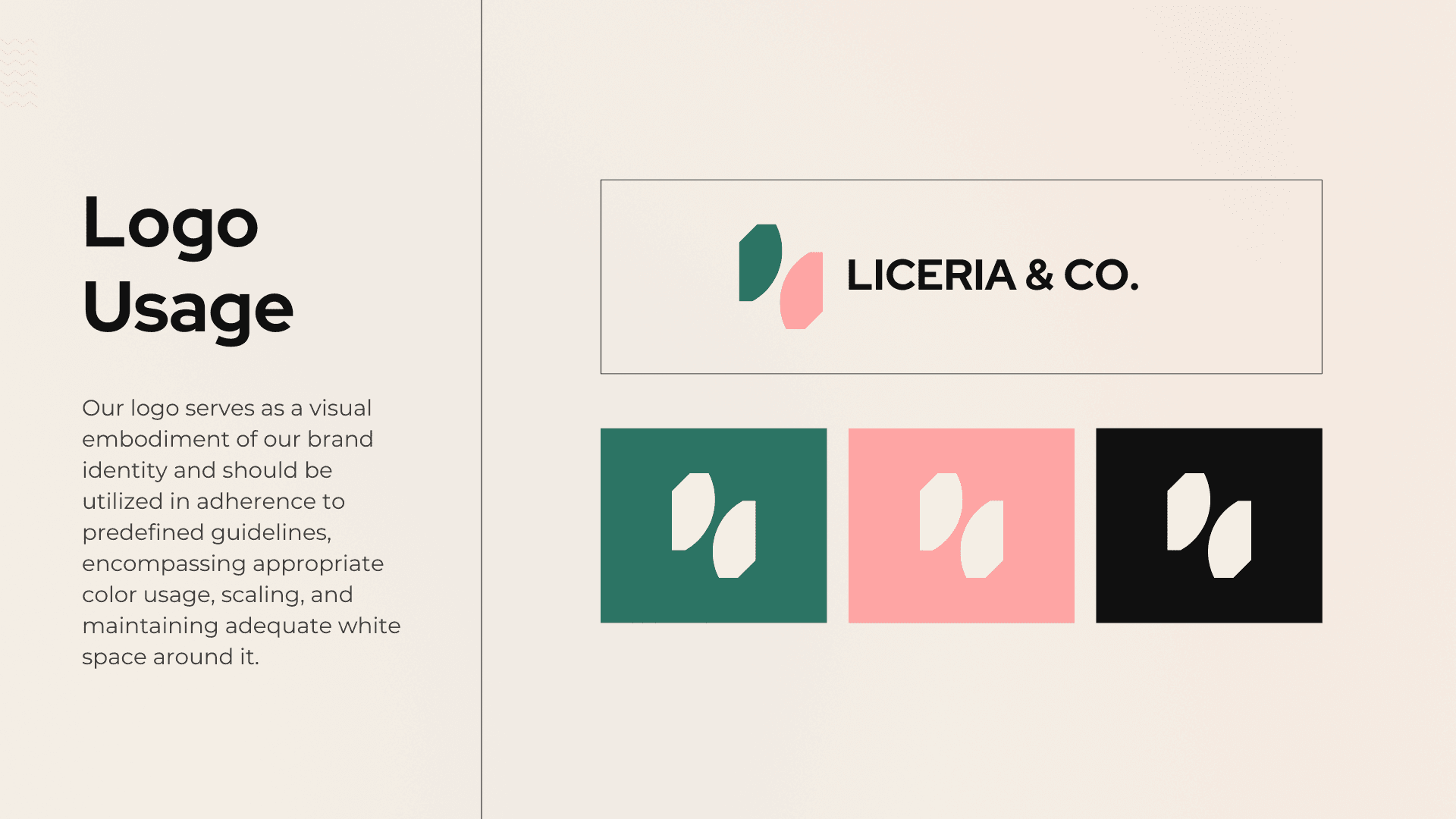
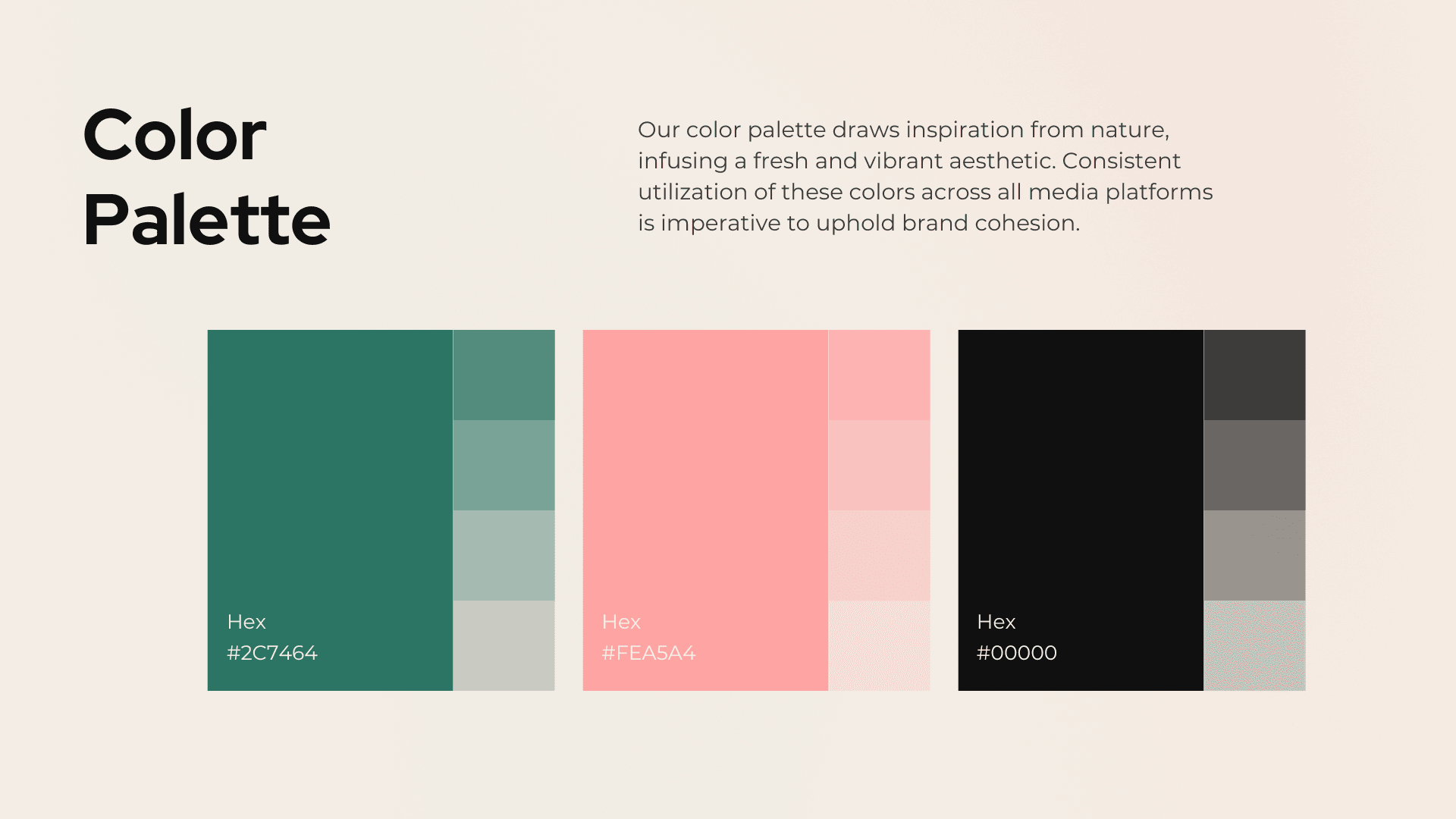
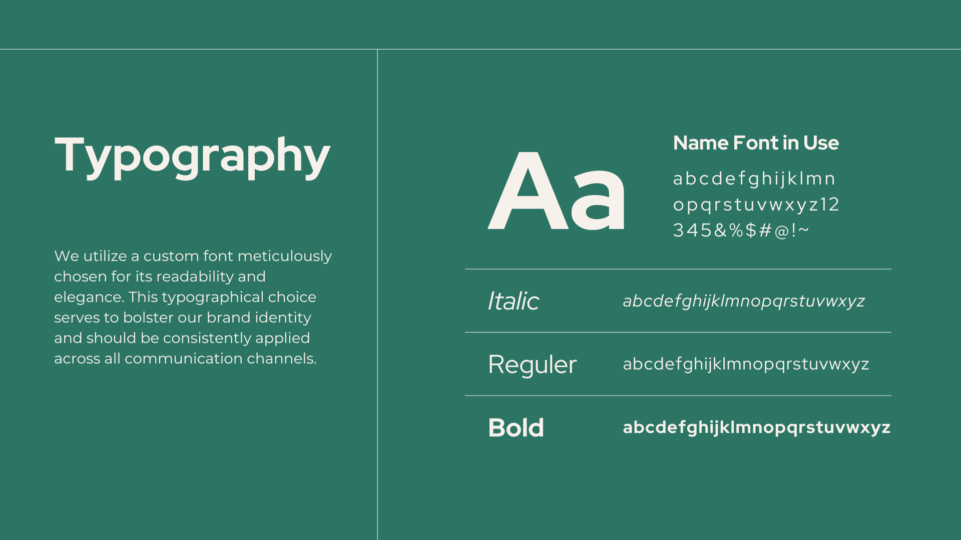
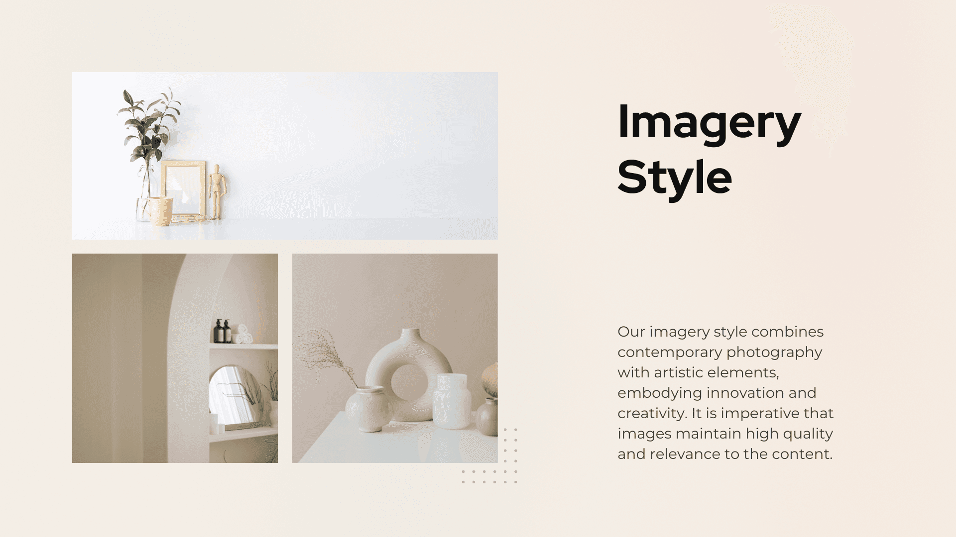
The decision was to go the opposite direction from the category - minimal, geometric, and restrained. The leaf mark is built from two intersecting circles, no illustration, no texture. The color palette uses forest green and cream as primary anchors but introduces a warm wheat tone to keep it from feeling cold or corporate. Every element was stress-tested at the smallest packaging label size before being approved for larger applications.

The Outcome
The identity launched across 14 store locations and the brand's own e-commerce site. Verdant reported a 34% increase in shelf pick-up rate in the first month compared to their previous unbranded packaging.
- Founder, Verdant Foods Co.