The Brief
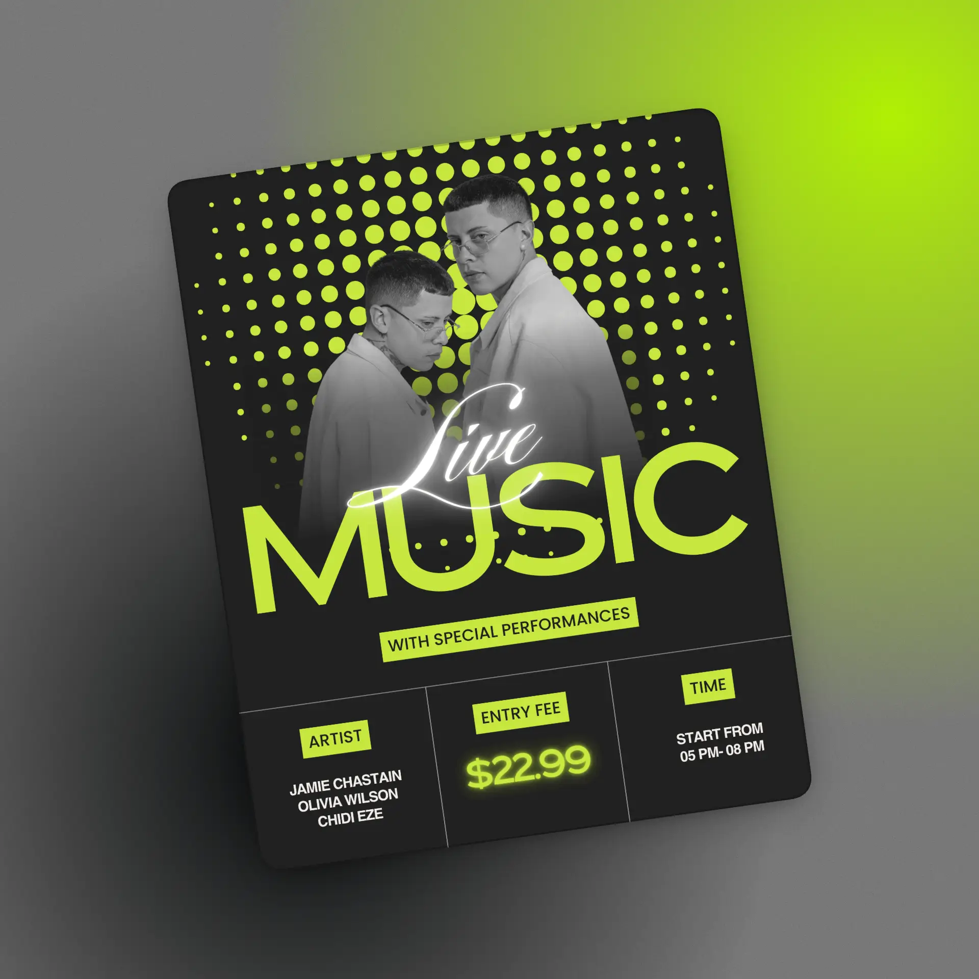
Pulse Festival wanted to completely break away from the generic rave poster aesthetic that had started to look the same across every underground event in the city. The ask was bold, raw, and slightly confrontational - designed to feel like it was torn off a wall, not printed in a studio.
The Approach
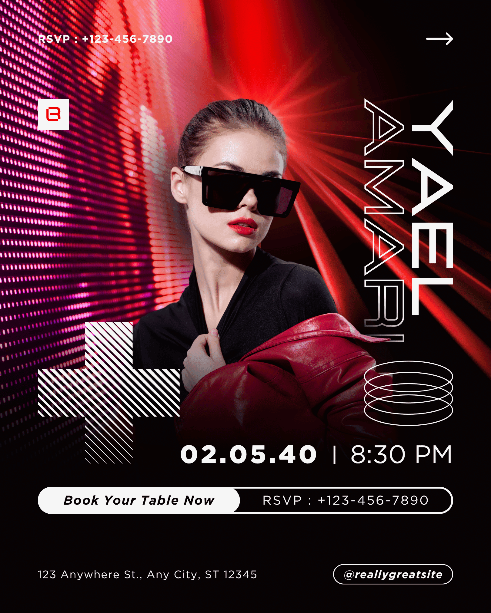
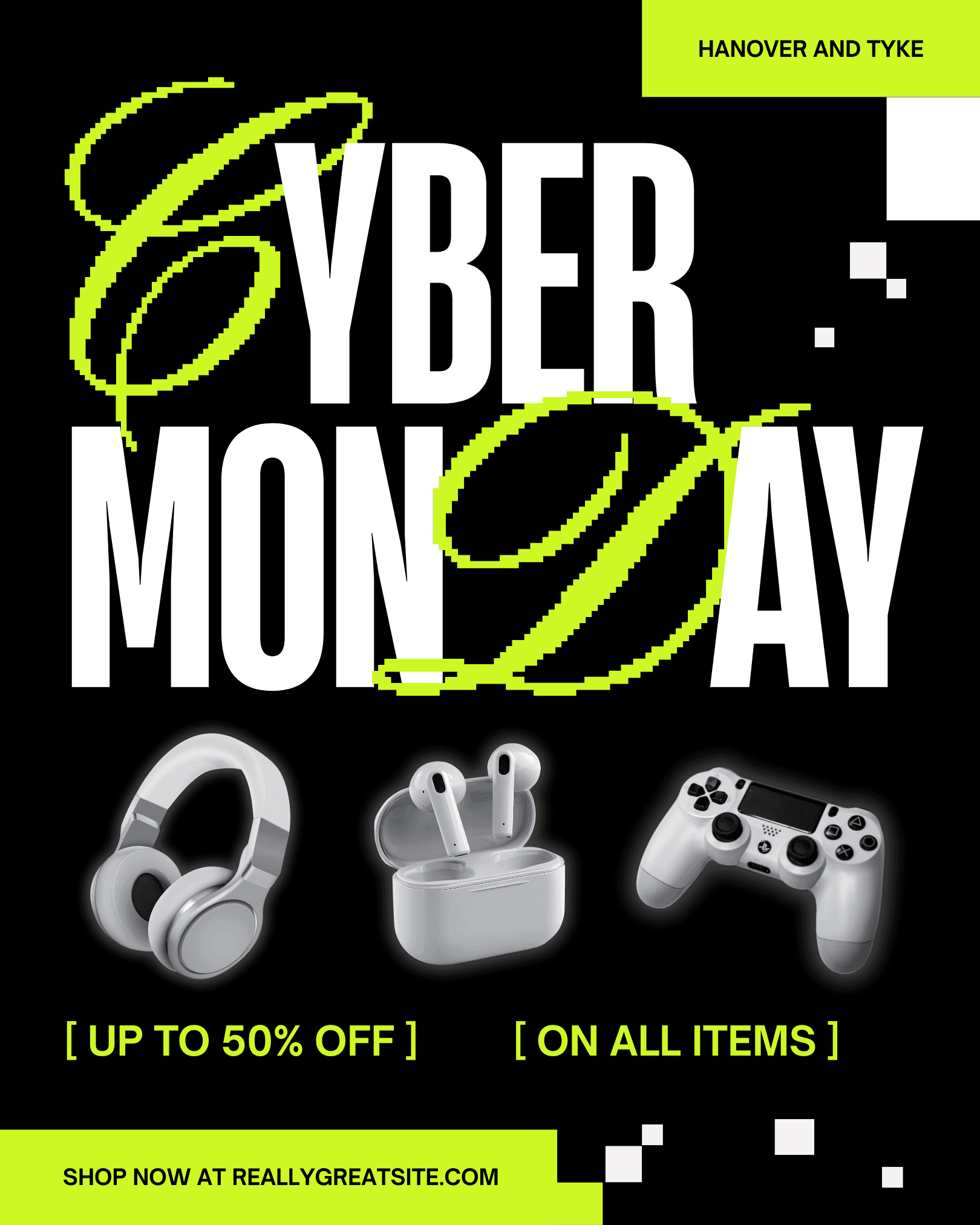
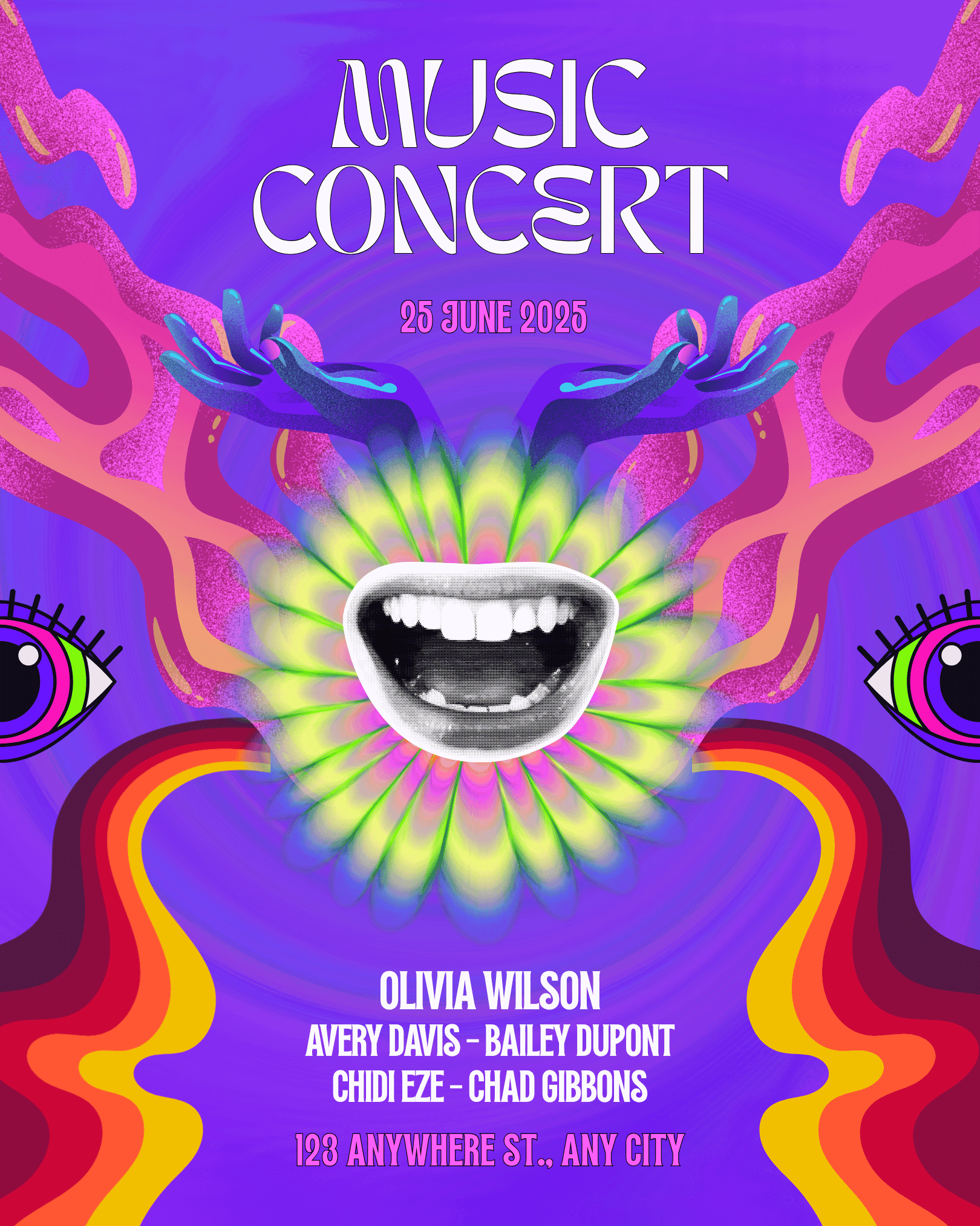
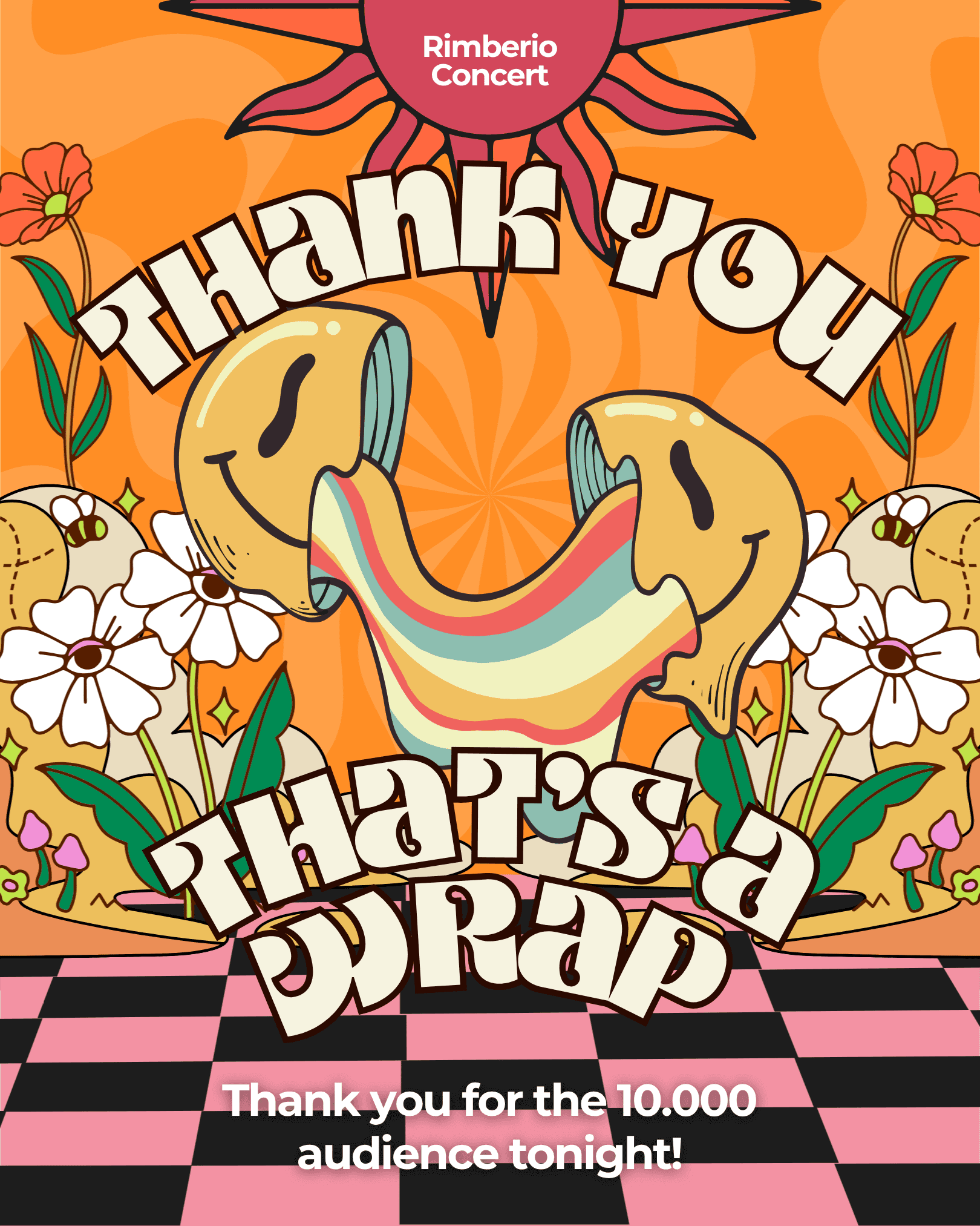
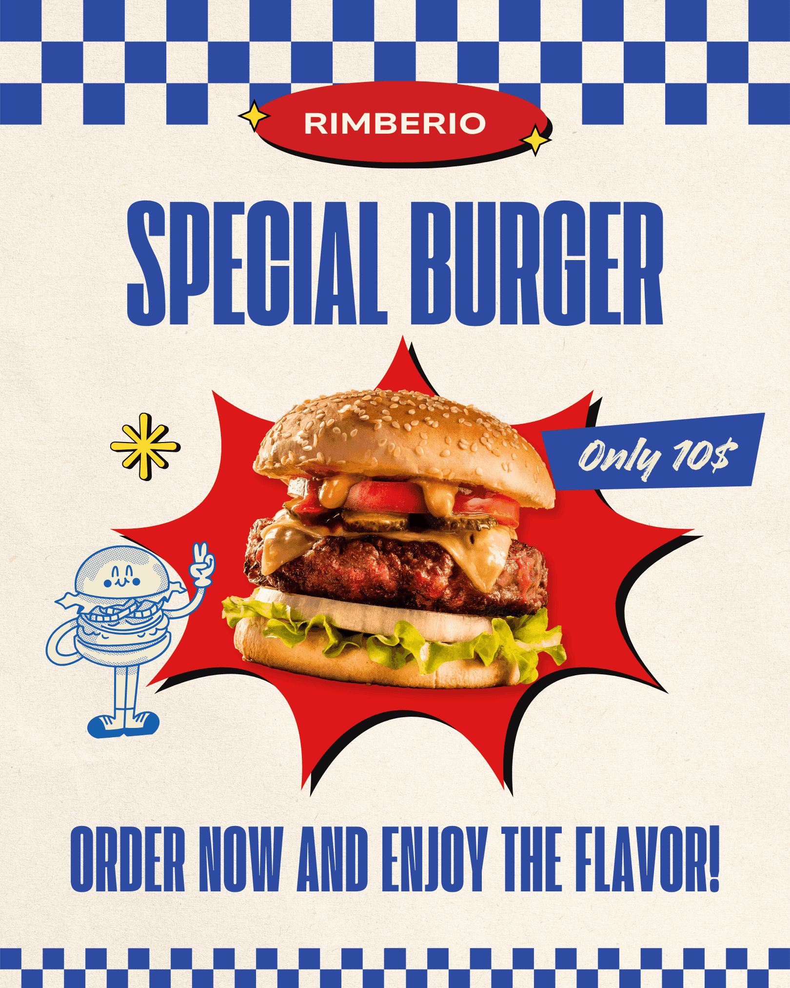
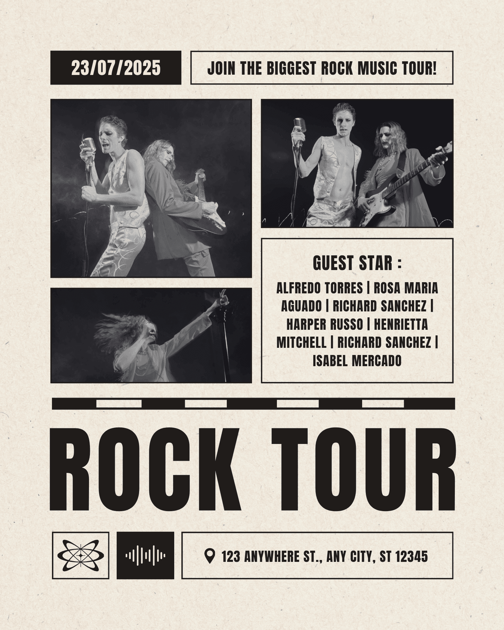
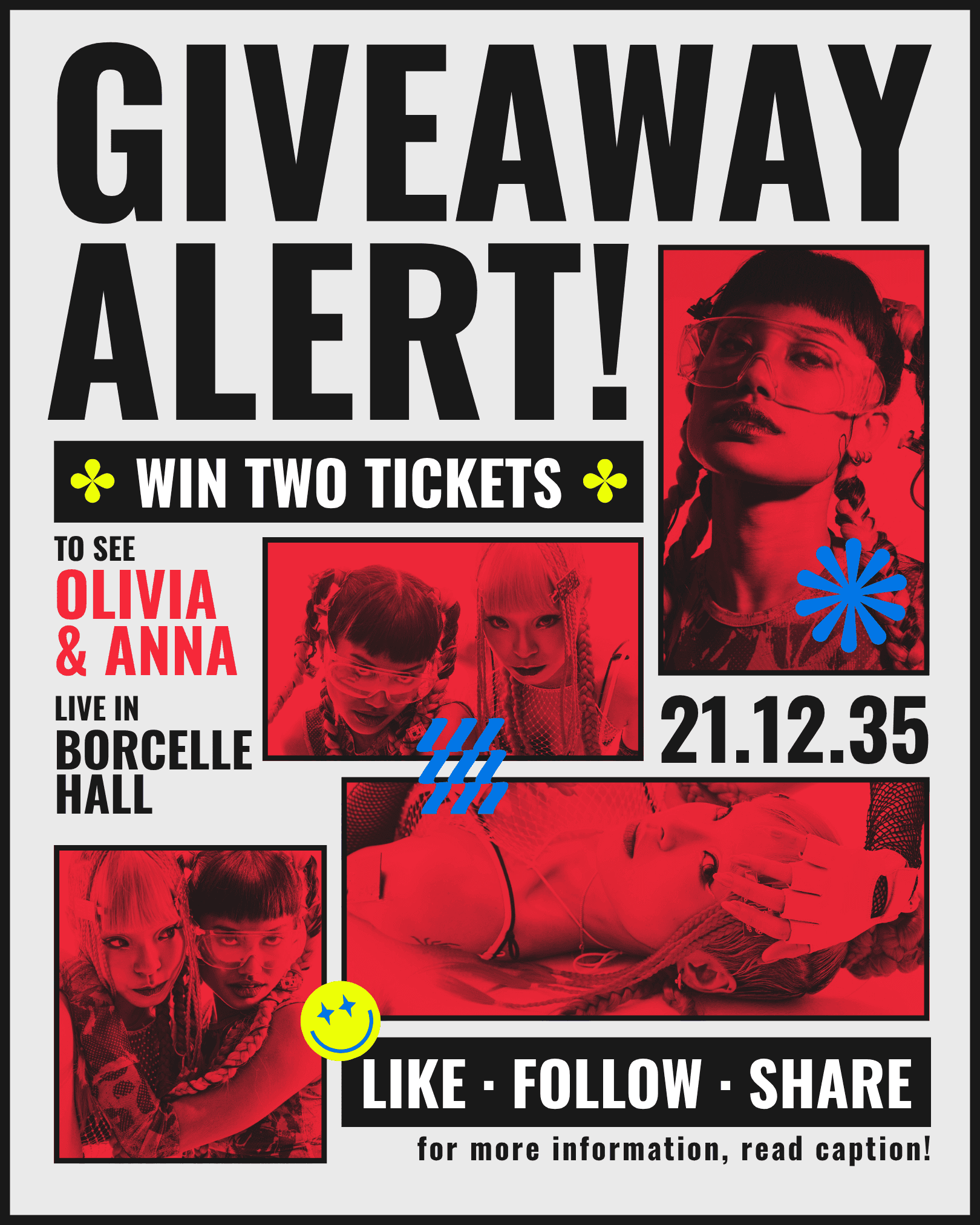
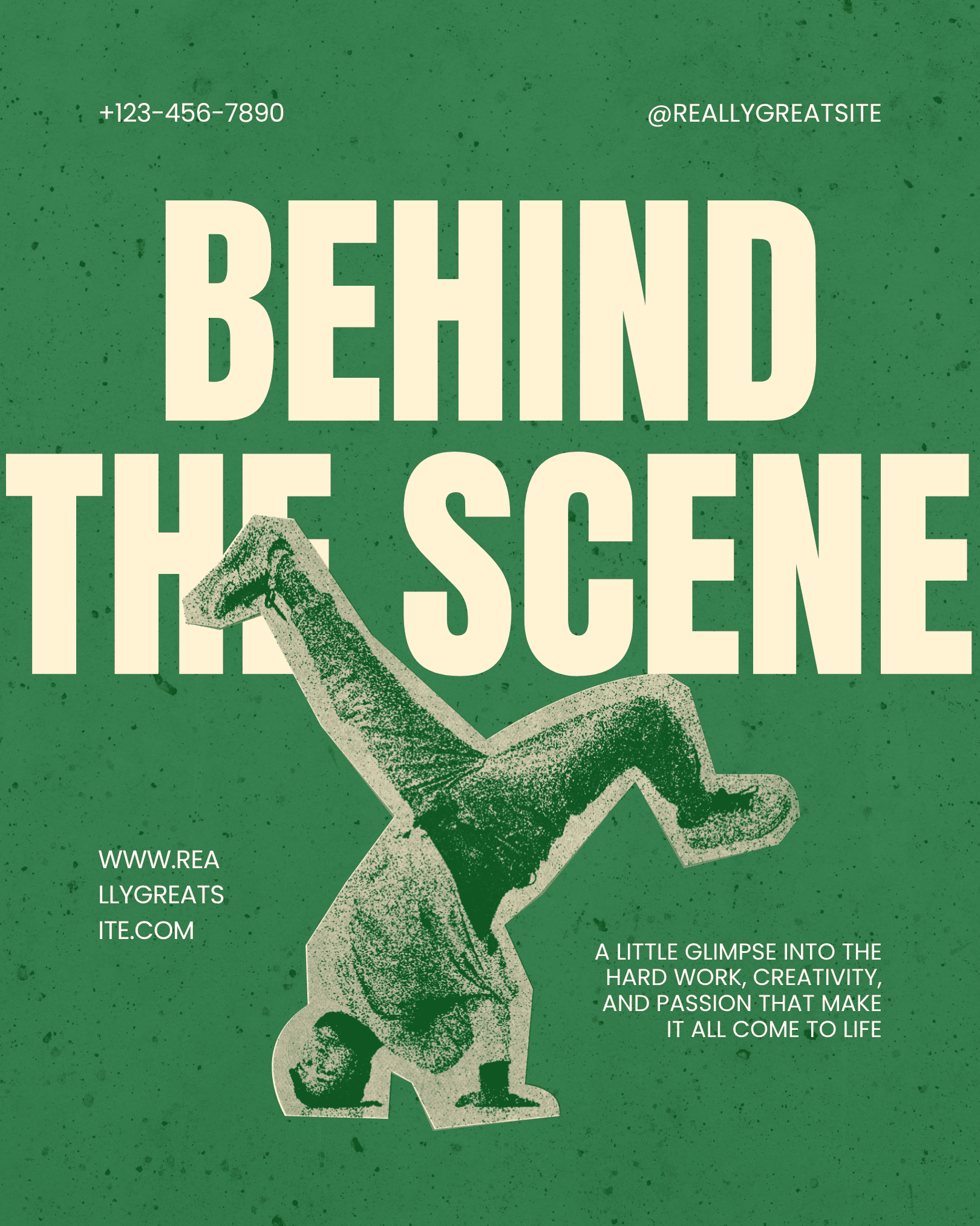
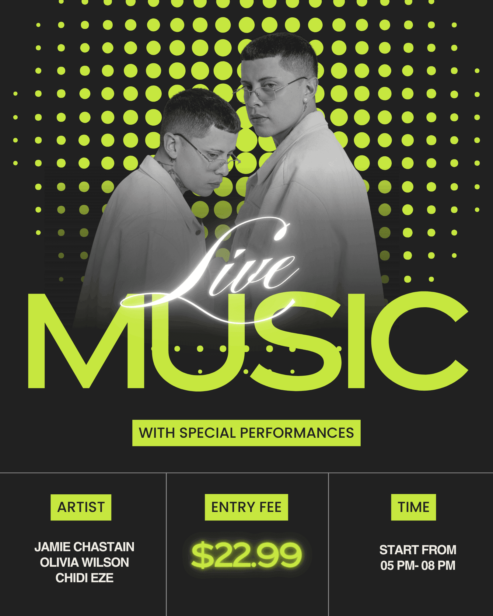
The entire system was anchored by a single typographic decision - overlapping, misaligned headline stacks that feel deliberately broken. Color was kept to two per poster, always neon on near-black, so the series reads as a family even when the headline acts and dates change across all 6 nights.

The Outcome
The poster series was adopted across all festival touchpoints including merch, wristbands, and stage backdrops. Limited print editions of two posters sold out within 72 hours of going live on the festival's online store.
- Creative Director, Pulse Festival